Sailor 1911 Standard / Sailor Profit Standard Demonstrator Fountain Pen Review


I’m switching to English Channel for the first time in this blog, see if I’ll be able to meet some new friends around the world.
While many people in my place(Hong Kong) know me as a large-format photo printing specialist at Trail Studio. I’m also an experienced product designer with engineering & manufacturing knowledge, so I can apply my knowledge when talking about fountain pens.
It seems to me that fountain pen is a matter of hit-or-miss. Problem is that, tolerance exists in every manufacturing process, it is not noticeable for most products, but is critical for fountain pen nibs, which require high precision as they rely on capillary-action to get the ink flowing. Unfortunately pen manufacturers aren’t doing rocket-science, and some problems may have been caused by the handling of retailers as well. Whatever brand of fountain pen may have a good chance to go wrong, it’s better to try the particular pen before you buy it, or to buy from nib-meisters who will test and adjust the pen. Or, at least read some reviews before making your purchase. So, here is my contribution to the great community of fountain pens.
Here we go, Sailor is one of the well reputed “big-3” Japanese fountain pen manufacturers, the other 2 being Pilot and Platinum (where is the Driver? Just kidding :D). I didn’t care about the Japanese pens in the early days of my pen journey as they look plain and boring, until I acquired some Pilot fountain pens and realized how precise the nibs were and how great the writing experience was.
The Japanese Fountain Pen manufacturers should be well respected because they are the very few contemporary ones who still manufacture their own nibs – the soul of fountain pens. They are able to offer a wide variety of nib options, giving unique characteristics to their pens. To be fair, some of my Japanese pens have issues just like their western counterparts, the gold-nib pen which gave me the most trouble ever, is another popular Japanese Pen, the #3776, I’ve made intensive adjustments to get it work well. Indeed I had worked on about 1/3 of my “branded” fountain pens to get them write well.
Some people consider the Sailor 1911 (as well as whatever black/gold cigar pens) as Mont Blanc knock-off, but to me the 1911 is just another cigar-shaped pens with basic(or classic) constructions. Many online sources suggested that the archetype of black/gold cigar-shape pens is the Sheaffer Balance, first introduced at around 1929 which pre-dated the MB Masterpiece line.
I don’t consider the 1911 as MB knockoff, but I can’t control what people think. I use my pens in business environments, to avoid confusions or misunderstandings, I’m forced to avoid the black-body 1911. I’ve been eyeing this demonstrator model for a long while, but a golden-converter was unavailable at the time, the chrome one was a poor match to the gold-trim (same case as the Platinum 3776 Nice), so I didn’t pull the trigger until I realized a golden converter is actually available.


Pen Body
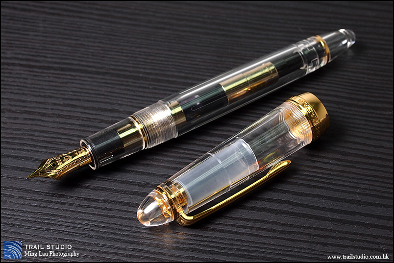
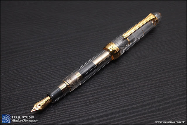
This is a 1911S demonstrator, S stands for “standard-size”. The Japanese pen was aimed for their own market, so it is a ok for we Eastern people to use it unposted. However, for Western people with larger hands, the “S” should in real-life stands for “short” or “small”, and the cap probably has to be posted before use. For a pen of such a small size, the metal piece in the section make this pen heavier than what it appears to be, and make it well balanced either with the cap posted or unposted. Some heft in a small body can mean quality to some people, including me.
I like big pens, but for the 1911 demonstrators, I prefer this 1911S over the 1911L because I love the proportion of the smaller barrel to the inner workings(i.e. the piston converter) – there is not much empty space inside the pen, it’s transparent but not hollow, and reminds me this pen is small but practical. In contrast, the internal space of the barrel of the 1911L demo looks a bit wasted to my own taste, it also reminds me the Sailor converter is of low ink capacity and doesn’t utilize the advantage of the larger pen body. Anyway, if you’ve big hands, it’s better to get the 1911L.
Here comes my biggest criticism – the cap doesn’t post well. It is friction-fit, but the area of contact between the barrel and the cap is extraordinarily narrow, you’ll need to press hard to produce sufficient friction and you know you’ll scratch the pen very soon. More to the problem, resting your hand not exactly on that narrow ring-of-contact will create a leverage and wobble the cap slightly, that’s annoying and is enough to break the friction all in a sudden, the cap may then fall out easily as the tapered barrel can’t encase it. I suspect this problem is unique only to the demonstrator model with large single metal cap-ring, as the cap opening is made larger to avoid the metal ring from scratching the plastic (or “precious resin”) of the barrel, it looks great but doesn’t work well.

Now comes my second complaint about this pen. Many of us get used to flush the section before use, or when changing ink (the maintenance procedure is written in the user manual as well). Unbelievably, doing so is not good for this pen! Water will run through 2 little trenches at both sides of the feed collar (the black plastic part) and trapped inside the clear section if you flush it the usual way. I had to disassemble the pen and wait for 1 or 2 days to have the water evaporate. If ink goes inside this space it will be difficult to wash it out (perhaps try using syringe), and it may stain or corrode the metal, that will be ugly. I guess the best way to clean the pen is to keep the converter attached and soak the water up through the nib, or to flush it with the nib ALWAYS facing upwards.
The pen clip wobbles sideways a bit, not ideal but no big deal. I like the shape of this old-clip far more than that of the “Sigma” or “Mk.ll” version. To me, the clip of the Sigma version looks like a skateboard, and the anchor-shape thing on it is too big and looks “cartoonish”. Sorry to say that the new clip design effectively stealth those new Sailor pens from my radar.
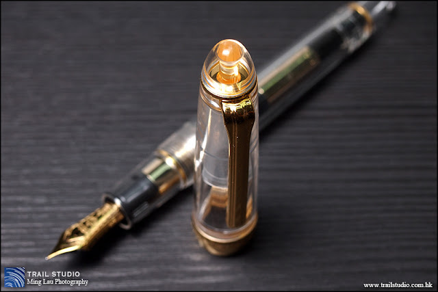
For a demonstrator pen, it’s always a good idea to display the nib with the use of a clear-enough inner cap. The inner cap of this pen is not spring-loaded like the Platinum#3776, but it’s quite elastic and is able to create an air-tight seal, I didn’t experience hard-start or ink drying-out even when the pen is left inked for 2+ weeks. The plastic column inside the top of the cap looks like a cap jewel, a nice touch.


Another great feature with demonstrator pen is that, you are able to immediately know how much ink is left and what ink you’re using without unscrewing the barrel.
Converter and ink capacity
As mentioned, the ink capacity is low, I didn’t actually measure it, by observation the cavity is short and narrow, and ink level drops fast even that I’m not a heavy pen user and the nib is relatively dry. The converter can be dissembled easily by twisting the metal collar, pay attention not to twist it when you operate the piston, otherwise it may lead to ink leakage, I bet you don’t like to demonstrate this. It’s good to put silicon grease inside of this collar and around the piston knob as a safety measure.

Nib & Feed
The nib art is appealing, it is marked as H-F (hard fine) and writes relatively dry, with some feedback on certain papers. It writes finer than my other japanese fine-nibs. The feedbacky feel is consistent across different writing angle and directions, and since the first day I inked it, this means the nib is well-ground. I’ve inked it with several J.herbin inks, which all worked well so I didn’t try other inks, I’m afraid there’ll be flow issues if thicker/more viscous inks are to be used.
It’s easily one of the hardest nibs I’ve ever used, you won’t get much line variation unless you press it real hard, but the relatively tapered tip allow the nib to get some barely noticeable “initial spring”, I mean, the slit opens very slightly when it touches the paper and then stopped there, not enough to produce noticeable line variation, but sufficient to pour down a bit more ink to produce nice shading. I’m very happy with the performance of this nib.

It seems that Sailor’s (fine) nib is well-known for a distinctive feedbacky feel, it somehow feels like writing with a very sharp 2H pencil. It’s not my scientific analysis but just theory, the feedback is not produced with any secret recipe, but simply because these factors happen altogether:
1) the tipping material is smaller and it writes finer than the other Japanese “F”, it’s probably EF by Pilot’s standard. It’s just not easily noticeable especially as the “initial springiness” widen the line to the other Japanese “F” standard before firmly stops there.
2) it’s on the dry side so it receives less lubrication from ink
3) it’s really nail-hard (the “initial springiness” I mentioned isn’t noticeable at all) so there’s no damping when the nib glides across the paper.
Besides viewing under a loupe, one easy way to distinguish between a good feedbacky nib and a faulty scratchy nib, is to draw a horizontal straight line, then draw again in backward direction, and repeat with lines of other angles. If the nib is significantly scratchier on some lines/directions, chance for a mis-aligned slit or a deformed tip is high.
Conclusion
This is a great c/c demonstrator pen, and for people with big hands, it is especially excel as an EDC pen: small thus handy, with a little bit of heft but not heavy, most importantly it writes really well. It is eye-catching with its crystal clear body and gold trims, and people can easily tell it’s a fountain pen – a good tool for fountain pen addicts to reveal their identity! With this pen, you always know how much ink is left so there’s no worry about running out of ink in a sudden – a good feature for an EDC pen as refilling it on-the-go is usually not an option. Unfortunately the cap doesn’t post well, and can be a problem for EDC pens in situations like jotting quick notes without a desk, it’s still ok if you pay attention, just don’t lend the pen to the others with the cap posted.